Version 3.10 beta
3 posters
Page 1 of 1
 Version 3.10 beta
Changes:
Version 3.9.3.2
- For the faders and V-pots on the Generic Midi and Mackie Control dials, you can switch places for the title and the value.
- Titles on V-Pots are scaled to fit better in the available space.
- The default min value for dB files is changed from "-Inf" to "-oo". The displayed text can now be set using the value 0 entry in the dB file.
- There is a new variable to reference in the title fields for the Mackie control dials. #CHNR1# will display channel numbers in the range 1-8, while #CHNR# uses the range 0-7.
- Bug fixes.
Version 3.9.3.2
 Re: Version 3.10 beta
I have tested all the new improvements using several configurations for the faders and V-pots on the Generic Midi and Mackie Control dials with Cubase Pro 12 and Live 11 Standard.
I find that everything works perfect except a little issue. Steps to reproduce it:
- Create a new Mackie Control dial
- Create left and right tap actions showing state icons
- Title: #LCDL# for Cubase or #LCDU# for Live
- Create a track called "MSVAnalog"
Enabling "Value at the top, Title on the fader" will show six characters of this track name: "MSVAna"
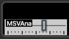
Enabling "Title at the top, Value on the fader" will show only four characters of this track name: "MSVA"
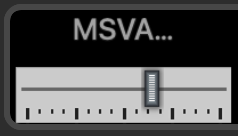
If you change "MSVAnalog" to "MSIAnalog" you will see five characters at the top, so the issue depends on the width of every character.
If showing state icons is disabled in the dial configuration, the title at the top shows the six characters.
I find that everything works perfect except a little issue. Steps to reproduce it:
- Create a new Mackie Control dial
- Create left and right tap actions showing state icons
- Title: #LCDL# for Cubase or #LCDU# for Live
- Create a track called "MSVAnalog"
Enabling "Value at the top, Title on the fader" will show six characters of this track name: "MSVAna"

Enabling "Title at the top, Value on the fader" will show only four characters of this track name: "MSVA"

If you change "MSVAnalog" to "MSIAnalog" you will see five characters at the top, so the issue depends on the width of every character.
If showing state icons is disabled in the dial configuration, the title at the top shows the six characters.

jordikt- Posts : 294
Join date : 2024-02-10
 Re: Version 3.10 beta
The new three options to switch the position of title and value are GREAT.
I would like to propose some changes in the Mackie Control and the Generic Midi dials for a better matching of colors between the screen display and the editor configuration.
The changes would be the following:
1) Move the circled i of information below the "Title" label (Mackie Control only)
2) Set the "Title" and "Value display" fields to the same length, with enough room for two color selectors at the right
3) Change the behaviour of the color selectors for Title/Value depending on the positions choice like this:
- Enabling "Value at the top, Title on the fader" shows font colors in both fields and background color in the "Title" field
- Enabling "Title at the top, Value on the fader" shows font colors in both fields but background color in the "Value" field
- Enabling "Title and Value at the top," hides the background color and shows font colors in both fields (if title and values can be shown with two colors at the top) or shows only one font color for both fields (if title and values must be shown with the same color)
4) The SD+ screen should match the selected colors for "Title" and "Value"
Example: let's take a track called GUITAR with Title set to green font/black background and Value set to red font.
Selecting "Value at the top, Title on the fader" the SD+ screen shows this...

...and the editor shows this:

In this case, color selectors and the display in the screen matches perfectly.
Now let's select "Title at the top, Value on the fader". The SD+ screen shows this...
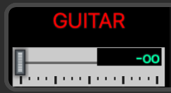
...and the editor shows this:
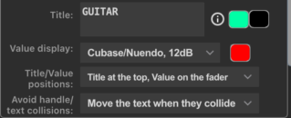
In this case, color selectors and the display in the screen are not matching correctly. They are inverted.
So I propose that the editor should show something similar to this (moving the circled i and the background color)...
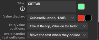
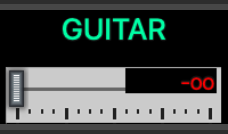
...and the SD+ screen should show this:
Selecting "Title and Value at the top" would follow the same schema: the SD+ screen would show this...

...and the editor would show this (if it's possible to show Title and Value in different colors)...
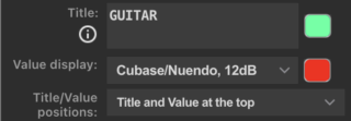
...or this (if it's necessary to show Title and Value in the same color):

These changes would also be useful for V-Pots, but without the background color selector.
I would like to propose some changes in the Mackie Control and the Generic Midi dials for a better matching of colors between the screen display and the editor configuration.
The changes would be the following:
1) Move the circled i of information below the "Title" label (Mackie Control only)
2) Set the "Title" and "Value display" fields to the same length, with enough room for two color selectors at the right
3) Change the behaviour of the color selectors for Title/Value depending on the positions choice like this:
- Enabling "Value at the top, Title on the fader" shows font colors in both fields and background color in the "Title" field
- Enabling "Title at the top, Value on the fader" shows font colors in both fields but background color in the "Value" field
- Enabling "Title and Value at the top," hides the background color and shows font colors in both fields (if title and values can be shown with two colors at the top) or shows only one font color for both fields (if title and values must be shown with the same color)
4) The SD+ screen should match the selected colors for "Title" and "Value"
Example: let's take a track called GUITAR with Title set to green font/black background and Value set to red font.
Selecting "Value at the top, Title on the fader" the SD+ screen shows this...

...and the editor shows this:

In this case, color selectors and the display in the screen matches perfectly.
Now let's select "Title at the top, Value on the fader". The SD+ screen shows this...

...and the editor shows this:

In this case, color selectors and the display in the screen are not matching correctly. They are inverted.
So I propose that the editor should show something similar to this (moving the circled i and the background color)...

...and the SD+ screen should show this:

Selecting "Title and Value at the top" would follow the same schema: the SD+ screen would show this...

...and the editor would show this (if it's possible to show Title and Value in different colors)...

...or this (if it's necessary to show Title and Value in the same color):

These changes would also be useful for V-Pots, but without the background color selector.

jordikt- Posts : 294
Join date : 2024-02-10
 Re: Version 3.10 beta
Thanks for your valuable feedback. I didn't consider the color settings when I added the title/value options. 
 Re: Version 3.10 beta
I have fixed the scaling of the top text for the Generic Midi and Mackie Control dials so it isn't truncated.
I have reworked the color settings for the Generic Midi dial. The Mackie Control dial has not been changed yet.
Version 3.9.3.14
I have reworked the color settings for the Generic Midi dial. The Mackie Control dial has not been changed yet.
Version 3.9.3.14
 Re: Version 3.10 beta
The scaling of the top text for the Generic Midi and Mackie Control dials works like a charm. 

The new color settings for fader and vpot in the generic midi dial is perfect.

To avoid larger scroll, the labels "Top text", "Fader text", "Background font text", "V-Pot text" could be removed, adding a circled i after the 3 color selectors.
The circled i could explain what every selector color does.
Awesome update!!!

The new color settings for fader and vpot in the generic midi dial is perfect.
To avoid larger scroll, the labels "Top text", "Fader text", "Background font text", "V-Pot text" could be removed, adding a circled i after the 3 color selectors.
The circled i could explain what every selector color does.
Awesome update!!!

jordikt- Posts : 294
Join date : 2024-02-10
 Re: Version 3.10 beta
The color handling is added to the Mackie dial, and some tweaks are made to ensure that font sizes are handled correctly in all possible combinations (hopefully).
Version 3.9.3.43
Version 3.9.3.43
 Re: Version 3.10 beta
3.9.3.43: Faders and V-Pots for Mackie and Midi dials works fine. The labels for color selectors are perfect.
Some details in the UI:
1) "Colors:", "Top text" and "V-pot text" labels are not vertically aligned in V-Pots of Mackie and Generic Midi dials

2) The "Title" field is larger than the other fields in Faders and V-Pots of Mackie and Midi dials.

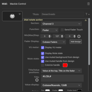

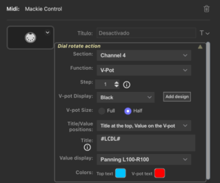
Tested in Stream Desk Plus 6.6.0 (20583) and MacOS 13,6,6 Ventura
Some details in the UI:
1) "Colors:", "Top text" and "V-pot text" labels are not vertically aligned in V-Pots of Mackie and Generic Midi dials

2) The "Title" field is larger than the other fields in Faders and V-Pots of Mackie and Midi dials.


Tested in Stream Desk Plus 6.6.0 (20583) and MacOS 13,6,6 Ventura

jordikt- Posts : 294
Join date : 2024-02-10
 Re: Version 3.10 beta
Visual issue in the Right Screen Tap Action of Mackie Control dials.
Steps to reproduce it:
- Add a Mackie Control dial
- Select any channel and any function in the Right Screen Tap Action
- Enable "Show State Icons"
- Select "None" in the Section menu
- The configurations of icons is not hidden as it should be
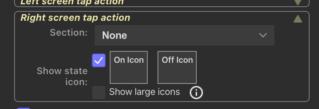
Steps to reproduce it:
- Add a Mackie Control dial
- Select any channel and any function in the Right Screen Tap Action
- Enable "Show State Icons"
- Select "None" in the Section menu
- The configurations of icons is not hidden as it should be


jordikt- Posts : 294
Join date : 2024-02-10
 Re: Version 3.10 beta
Thanks for the feedback.
Regarding the alignment issues, yes - I know. I'm constantly fighting the Stream Deck CSS settings that cause weird things to happen.
Regarding the alignment issues, yes - I know. I'm constantly fighting the Stream Deck CSS settings that cause weird things to happen.
 Re: Version 3.10 beta
Admin wrote:Regarding the alignment issues, yes - I know. I'm constantly fighting the Stream Deck CSS settings that cause weird things to happen.
Sorry to hear that!!

jordikt- Posts : 294
Join date : 2024-02-10
 Re: Version 3.10 beta
Version 3.10 is stopped from being published due to new bug reports.
Hopefully, all issues are solved with...
Version 3.9.3.50
Hopefully, all issues are solved with...
Version 3.9.3.50
 Re: Version 3.10 beta
Regarding Title/Value issues when rotating while pressed action in 3.9.3.50:
1) MACKIE CONTROL V-POT
V-POT size Full & Title at the side, Value on the V-Pot: Rotate while pressed action hides the title.
V-POT size Half & Title and Value at the top: Rotate while pressed action works correctly except if value is set to None. If value is None, the Title is hidden.
2) GENERIC MIDI V-POT:
V-POT size Full & Title at the side, Value on the V-Pot: Rotate while pressed action hides the title.
The rest of issues are fixed. Happy to see the off-alignment view is back!! Thanks!

jordikt- Posts : 294
Join date : 2024-02-10
 Re: Version 3.10 beta
I thought I tested all scenarios, but obviously not... 
Thanks.
Thanks.
jordikt likes this post
 Similar topics
» Version 3.8 beta
» Version 3.6 beta
» Version 3.9 beta
» Version 3.7 beta/preview
» Cubase Version 1.4.4 and Nuendo version 1.0.1 released
» Version 3.6 beta
» Version 3.9 beta
» Version 3.7 beta/preview
» Cubase Version 1.4.4 and Nuendo version 1.0.1 released
Page 1 of 1
Permissions in this forum:
You cannot reply to topics in this forum
